Can a first impression answer the question ‘What is a design museum?’
A user-centered approach to re-skinning Cooper Hewitt’s collection homepage.
The latest redesign of Cooper Hewitt’s collection site homepage offered a chance to reestablish the first impression of the collection and the museum. A user-centered approach to the design enabled us to revisit the complexity of the museum’s collection and Cooper Hewitt’s mission through design and experience.
What is a design museum? It’s a question that’s not so easy to answer. Wikipedia defines design as “… a plan or specification for the construction of an object or system or for the implementation of an activity or process, or the result of that plan or specification in the form of a prototype, product or process. The verb to design expresses the process of developing a design.”
The definition of design is a conceptual labyrinth, making an explanation of a museum dedicated to the broad concept more difficult to explain than an art or a science museum. We could say that a design museum’s collection is driven by the intention to define design through its objects, so helping visitors to understand the collection will in turn help them to define and understand the museum itself.
“a design museum’s collection is driven by the intention to define design through its objects”
For Cooper Hewitt, it means finding the quickest path to explaining a collection that ranges from Egyptian ceramics and textiles to contemporary 3D-printed objects and digital code.
In user-centered design terms (defined by Donald Norman in The Design Of Everyday Things from 1988) it means we want to help a user build a conceptual model of the museum’s collection by ‘making things visible’ so they understand where they can go, what they can explore, and how to do that.
So, what’s the right conceptual model of the collection, what does that even mean, and for a minimum viable product, what’s the most important thing we can do?
In a data-wayfinding project what’s the key data and how do we lead people there?
Who are the users and how much do they already know coming into this experience? How can we use what we know about the extent of a user’s knowledge to design a system to help them navigate? How can we use web analytics to give us feedback into the extent of a user’s knowledge to inform future collection data-wayfinding design decisions?
We’ve got more questions than answers, but our design decisions are meant to help us organize the analytics into understandable feedback so that we can make more informed and exploratory choices in the future.
Rebuilding the entire collection site as a user-centered design project is massive and we’ve only begun to approach this task, but we’ve started with the logical home of the conceptual model, the homepage.
For online visitors stuck at home, first impressions matter.
In the first 5 months of the pandemic, Cooper Hewitt’s collection site saw a 44% increase in users compared to the same period the previous year. This was a large uptick compared to only a 4% increase in users on our collection site for the 5 months prior to the pandemic compared to the previous year.
What this tells us is that the pandemic caused a massive surge in people eager for content. Being stuck at home meant that more people, from more places, were spending more time on the collection site. With this sudden and obvious shift in interest, the museum decided to focus on the first impression. The homepage is the primary opportunity to help a user build a conceptual model from which they would explore.
“The homepage is the primary opportunity to help a user build a conceptual model from which they would explore.”
The primary objective was to enhance the user’s experience, but this increase in discoverability meant that we would have greater feedback into user’s browsing behavior, their interests, and the limitations of our own assumptions.
Through a re-skin of the collection homepage, could we:
A) Help users understand the museum by helping them understand the breadth and depth of the collection, so that we can -
B) Enable users to explore the collection site given their new understanding of shape of the collection, in turn helping us to -
C) Better understand how users are navigating the site, and what their interests are and uncover design flaws, so that we could-
D) Develop a plan for the next round of design changes?
Show the breadth and depth of the collection so that a spectrum of users can understand it.
The range of audiences visiting the collection site all bring different expectations and understanding of what design is when they visit. Building a home page with various entry points for users was a way to address this multiplicity of user types and the vastness of the collection (more than 200,000 objects). Upon arrival, we hoped the design of the homepage offers a glimpse of the possibilities for what might be — what is waiting to be discovered.
To put it in user-centered design terms (defined by Donald Norman in The Design Of Everyday Things from 1988), we want to help a user build a conceptual model of the museum’s collection by designing a page that “makes things visible” so that they can understand where they can go, what they can explore, and how to do that.
“we want to help a user build a conceptual model of the museum’s collection by designing a page that “makes things visible”
The collection homepage hadn’t been updated since its launch in 2014. Fortunately, the good bones of the site allowed the development team to re-skin the site using only existing functionality repurposed with the user in mind, without having to rebuild the entire thing from scratch.
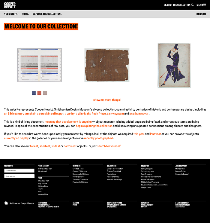
Collection homepage prior to re-skin:

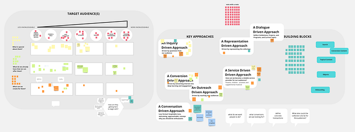
Working remotely in Miro, the team mapped out the users and approach to representation that would guide the build of the site in phase 1 and into the future.


Just as we mapped the intentions of a spectrum of audiences from least knowledgeable to most knowledgeable, this same approach was applied to the distribution and approach to content on the page.
Simply put, we put the broadest content for the widest audiences at the top, and got granular as we continued down the page.

Search data as insight into user interest, and a pathway to prioritizing data on the back-end

Imagine if you were to visit the National Brumble museum specializing in Flumbarts made from petrified Taesholf, mined in West Limestonia and made during the mid Egghart period. You might not know where to start, or what to search for. Just as we can’t assume that you’ll know how to search for that special Flumbart, we also can’t assume that someone new to a design museum will know what to search for either.
“By understanding what people are searching for we can evaluate our assumptions on how we’re describing and cataloguing on the back-end so that we may improve the results to queries and filters on the front end.”
At every decision point, we’re assuming that there’s an audience that needs a little handholding who doesn’t know where to start or has some ideas but might need that spark of inspiration to find something they didn’t know they wanted to find.
Even when we present our ‘example searches’ we’re aiming to present a breadth of the collection to present search trends and to present facets of the collection that might have gone overlooked. Our choices here are part of helping the user to create that conceptual model of what’s in the collection.
By prioritizing the search and providing these sample searches we’ve increased searches from our homepage by over 70%. This increase in search means that we can track more searches giving us higher fidelity insight into what our user’s interests and intentions are.
By categorizing these results we’re also verifying if our data structures on the back-end are prioritized and organized to help return the best results. Were users searching for objects, designers, styles, media, time periods, object classifications?
This feedback is a key component of understanding what shared vocabularies are known and being used instinctually by our users. By understanding what people are searching for we can evaluate our assumptions on how we’re describing and cataloguing on the back-end so that we may improve the results to queries and filters on the front end.
Mapping a content strategy — Editorializing the collection site
During our research, it became obvious that the collections’ homepage could play an editorial role as part of a larger digital content strategy and be functional helping wayfinding.
We inherited a few main features:
Featured Objects: This small list of objects can be swapped easily, allowing the team quick response to current events, highlighting a rotating cast of objects. These objects are selected to represent departments, areas of study, or new and important acquisitions.
Highlights Packages: These are a digital collections of objects curated around a theme. We already had a small library of highlights packages but if we were to revisit and rebuild this library, what might it look like in the future? These highlights packages are important for both representing the collection to help build that mental model, and for providing a way to rapidly curate specific collections of objects to content-thirsty online audiences.
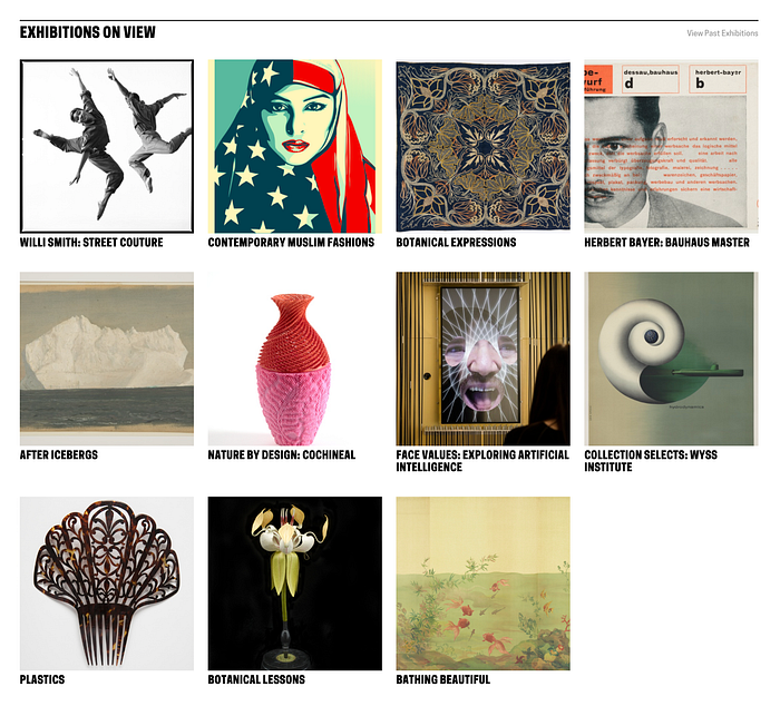
Exhibitions on View: We’ve created the ability to show the exhibitions by listing them visually to capture the user’s attention. This grid lists only the exhibitions on view. The “View All Exhibitions” function has increased exposure for past exhibitions. By simply showcasing these exhibitions, we’ve increased traffic to them over 400%.

Exhibitions on View: We’ve created the ability to show the exhibitions, and list them visually to capture the user’s attention. This grid lists only the exhibitions on view, however the ‘View All Exhibitions’ has also increased exposure of older shows no longer on view. By simply prioritizing these exhibitions, we’ve increased traffic to them over 400%.

Collections in Motion (Videos): The museum’s library of collection videos are often overlooked, but cover a wide range of topics. Surfacing these videos gives users clear access into a range of media the museum has created around the collection.

Departments: Although our initial assumption was that browsing by department is something only a more knowledgeable visitor would do, early analytics has revealed that browsing by curatorial department is a popular way to view the collection. We might be able to infer, then, that this supports the user-centered theory of the conceptual model. How better to understand the collection than through departments? How better to organize browsing with a broad but clear filter? What can this tell us about how we can organize browsing in the future?

Tracking user behavior
This is only a first step, a lightning fast re-skin of an under-loved but important stop in our visitor’s digital journey, at a time when visitation is at its most global and when digital experiences are needed more than ever.
Our design efforts have had an immediate, noticeable, and positive effect on the discoverability and usage of our collection site. This increase in usage and discoverability has also given us higher fidelity and confidence into tracking our audience’s interests, delivering a design change that has met our goals for phase 1.
· Increased visitation to exhibition pages up to over 400%
· Increased visitation to highlights packages up to over 1,600%
· Increased sessions with search up over 71%
· Decreased bounce rate down 18% on the homepage to under 25%
· Increased time on page up 30%
Next steps in user-centered design: Expanding the conceptual model for data-wayfinding
The future development of our collection site is an exploratory future, where we expect to design a flow that guides a user through the many facets, corners, and unexpected pockets of joy found in the collection. Our initial feedback indicates that helping users create a conceptual model of what’s there is a first step into helping them explore. While we’re still evaluating our current choices and planning future feature introductions, we’re pleased with the feedback from our rapid, straight-forward but timely re-skin.
